The high council of sports renews its corporate identity
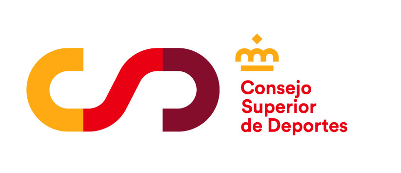
- With the objective of more modern elements that compose its visual image, the CSD will from now on with a new logo, composed of a font and colors, more dynamic and current
- For the president-in-office, Irene Lozano, this renewal is “ hopeful momentum ” in one year of so many difficulties, and “ an exciting bet for the future ”
- The introduction will be gradual and adapted to the social and economic realities in our country, so the modifications required in terms of stationery, señalética, or posters will be done in phases
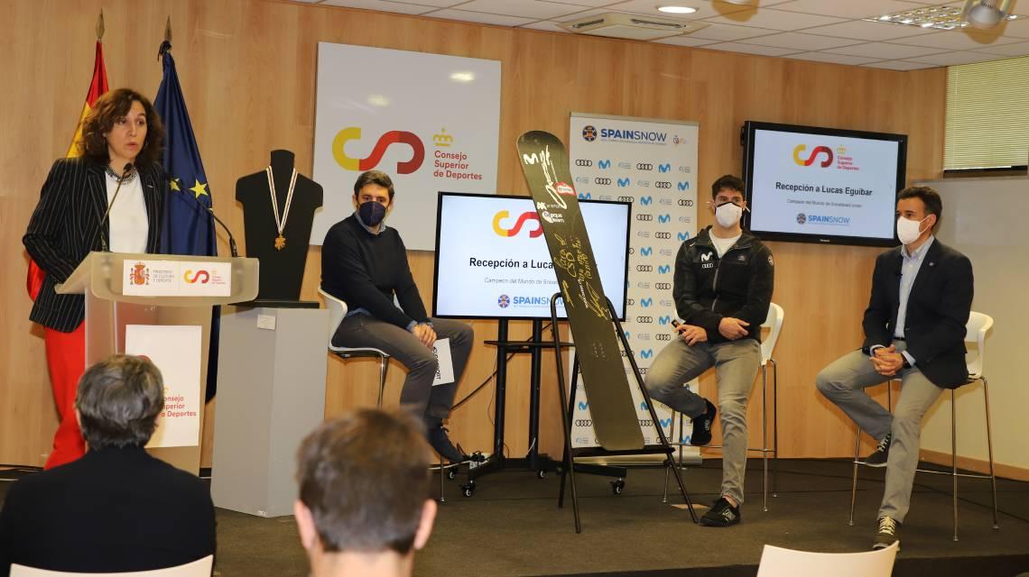
Madrid, 04 march 2021.-The high council of sports (CSD), introduced today by its new corporate identity based on common visual elements adapted to current forms and with some features of greater modernity and dynamism.
For the president of the CSD, Irene Lozano, exciting "is having a new, more modern simple and adapted to the future. The year of a pandemic so hard that we have been marked a turning point and, in that regard, now that the vaccination campaign is under way and we look at the next time a little more hope and optimism, we have believed it was a good time to renew the corporate identity of the house of sport. There comes a new era, a new era for sports has english, full of transformations, digitization and modernity. And the CSD will form part of this".
Modernity, dynamism and international projection
The logo, printing, as well as the colors, respond to the idea of simplicity, proximity and modernity that want to move from the institution, at the same time that reflect the values of sport.
Thus, the logo reflects an evolution of the most current letters about with greater movement and unity. The new CSD reminds a athletics track, cycling or even a racing circuit, which transfers the idea of dynamism so own sport. The same acronyms reflect, in addition, continuity. The intertwining all of them there is a principle and an end. Moreover, the crown and the letters that had hitherto been part of the logo, maintaining the institutional structure of an agency as is the Council for sports.
With regard to the font, becomes a more rounded spelling in line with the letters of the logo. While, as regards the colours are blue traditional through a variety of reds and yellows, peridot reflecting perfectly the identity of the brand Spain. This feature with international projection was also manifested in the respective logos as it may refer the “ S ” of Spain if used in portrait format.
The new design has developed, through a public competition, enterprise Interbrand, one of the biggest agencies of Europe.
The current economic and social situation will make the final implementation of this new identity be progressive. That is why the stationery, señalética, posters and other elements that will change.


